It’s hard to beat the experience of selling at a farmers market. They can be extremely profitable for your food or beverage business, so long as you can stand out from the crowd and attract customers over to your booth!
Other vendors can be a great source of inspiration for your business. But, if you’re busy selling, it’s hard to take notes on how you can improve your setup.
To help you out, we’ve compiled a list of our top tips for how to set up a vendor booth that’ll wow your customers and increase sales. Plus, get inspo and advice from four FLIP customers with outstanding displays!
9 Visual Merchandising Ideas for Farmers Market Displays
According to Point of Purchase Advertising International (POPAI), 62% of shoppers say they’ve made impulse purchases simply because the display was so appealing.
To help increase sales at future markets and encourage more impulse purchases, try out some of our tips below.
1. Create a Sense of Abundance
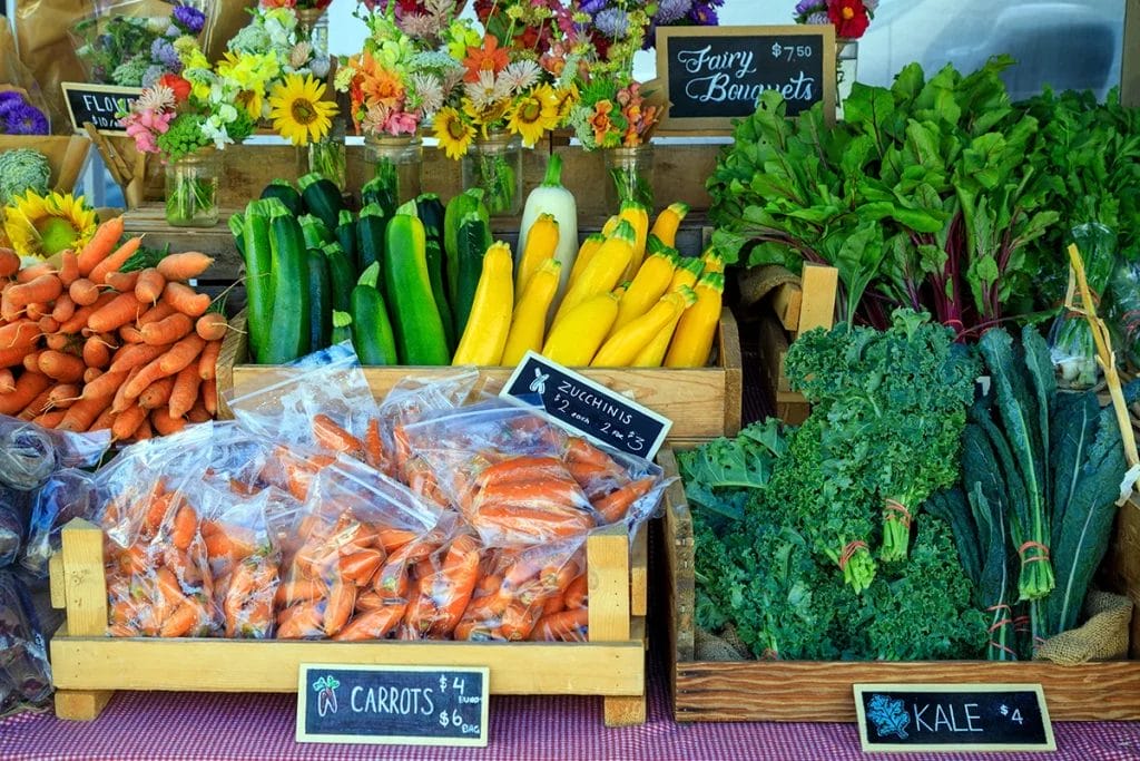
Farmers market displays that appear to be teeming with goods are more appealing to potential customers than ones that seem scarce.
Think about the produce displays at your local grocery store, for example—they always give a sense of abundance.
Take some cues from those merchandisers and try the following strategies to create generous, yet organized, displays:
- Leverage vertical space by stacking items on top of each other or by using shelves and racks.
- Use baskets and crates to organize items.
- Colorblock products to give a sense of variety at your booth.
2. Don’t Over Clutter
Yes, you want your display to look abundant and well-stocked, but not at the expense of organization! There is a fine—but important—line between a bountiful booth and a cluttered one.
You don’t need to cover every square inch of your setup with stuff.
Strategically leaving space accentuates what you have on display, drawing the eye to your shelves and baskets. While props and other decorations can be fun to add, be careful not to overdo it or you’ll distract customers from what you’re actually selling.

3. Clearly Label All Items
Many customers feel uncomfortable asking a seller about the price of an item they’re interested in. They may be less likely to make an impulse purchase if they have to take this extra step.
To avoid missing out on potential sales this way, create labels that are easy to read and secured in place so they don’t blow away when a gust of wind comes by.
Don’t be afraid to get creative with how you display prices, either! Chalkboards, whiteboards, and letterboards can add visual flair to your space while still being functional.
4. Offer Free Samples
Everybody loves free stuff! Offering samples gives you a great opportunity to educate customers about your products and for them to form an emotional connection with your product.
That bite-sized piece of your delicious lemon pound cake might just be the final push they need to make a purchase.
When offering free samples, display clear signage about those freebies around your booth! This is a great way to attract potential customers who are curious about what you have to offer but might not have otherwise stopped by.
5. Tell Your Story
A study by LeapMesh found that effective storytelling led to a 30% increase in conversion rates, meaning people are more likely to make a purchase when there’s a story element involved.
You can capture this magic at your booth by displaying photos accompanied by short captions that let customers know what they’re looking at.
- Grow your own produce or ingredients? Include a picture of your greenhouse or garden.
- Running a family business? Display a picture of your family and the history of your operation.
- Have a website or a social media presence? Add your website and social handles to your signage and business cards.
- Sell your goods online? Include signage with details on how and where customers can order from you.
These little additions to your table can make a big impact, as they help humanize your business and build emotional connections with customers. That in turn makes them more likely to want to buy from you.

6. Make Your Space Customer-Friendly
When planning your farmers market booth design, think about how you can arrange the area to provide the best possible customer experience.
- Make it easy for customers to enter and exit
- Keep high-traffic areas clear
- Decide on the best place for your point of sale
- Designate space for the stored inventory you’ll need to replenish your booth throughout the day
- Shield your goods and your customers from weather conditions (sun, wind, rain, etc.) with a canopy or tent with vinyl siding
7. Be Visible and Engage Customers
You’re the face of your business, so dress accordingly and wear clothes that easily identify you as someone working the booth. A branded T-shirt, apron, or cap are great options!
Additionally, make eye contact with customers and greet them with a smile. Try and strike up conversation when you can and maintain a friendly demeanor. People will feel more comfortable buying from you if they feel welcomed and invited.
It can be difficult when you’re busy working a booth to try and connect with every single person who approaches your table. But, as long as you’re making an effort and people see that you are friendly and personable, you’ll make a good impression.
8. Add Seasonal Flair
Incorporate seasonal colors to appeal to customer emotions and keep your booth looking fresh, especially if you vend throughout the year.
- Spring is a great time to add floral accents and pastel colors to your space.
- In the summer, incorporate red, white, and blue elements around the Fourth of July or opt for other bright colors.
- Warm, earthy tones like orange, yellow, and brown are great for the fall.
- Cool blues are perfect for a general wintry feeling, while red and green are often associated with Christmas.
This strategy also works well to showcase seasonal goods. For example, if you’re selling a pumpkin jam in the fall, accent your space with mini pumpkins to draw attention to this limited-time product.
9. Maintain Balance
Science has proven that human beings are attracted to symmetry in everything from faces to works of art. Take this into account when you’re deciding on your farmers market booth display.
While it may not be possible to create a perfectly symmetrical display, striving for balance will make your farmers market setup look more organized and professional. Displays that are very asymmetrical might appear haphazard, which will be less likely to draw in customers.
Stunning Farmers Market Display Ideas From FLIP Customers
We asked our fantastic FLIP customers to show us their displays, and they delivered! Find out what we love about each setup and get some tips and tricks from fellow food and beverage business owners!
Instagram: @fancynancyboards
TikTok: @fancynancyboards
Facebook: Fancy Nancy Boards


What We Love
- Sense of abundance: Fancy Nancy Boards has mastered the art of the bountiful display. While not a farmers market booth, businesses can take inspiration from her abundant yet organized grazing tables.
- Use of vertical space: The small shelves provide an aesthetically pleasing and organized way to display the mini donut cones.
- Color-blocking: The grazing table displays show how impactful color-blocking can be in drawing your eye to the table. Grouping similar colors and foods together next to those with contrasting colors makes for a striking setup.
- Seasonal elements: Small Halloween decorations in the charcuterie boxes lend a fun, seasonal feel.
“It’s okay to be particular about your display! I always say go big or go home. Nothing is ever too extra—you got this!” –Nancy Castro, Fancy Nancy Boards
Instagram: @dynamosdills
TikTok: @dynamosdills
Facebook: Dynamo’s Dills
What We Love
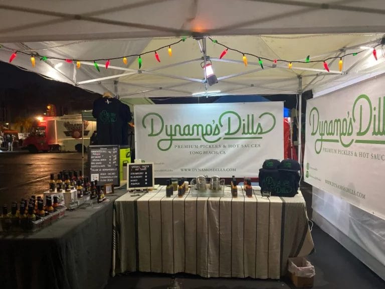
- Clean and uncluttered: Dynamo’s Dills keeps their table extremely organized and free of unnecessary clutter. There’s a healthy amount of empty space on each table to really accentuate the products they have on display.
- Clear signage: Letterboards make it easy for customers to tell what each item costs. The branded vinyl signs framing the booth are clearly visible, with information about where you can learn more about them (website, socials, etc.).
- Containers and shelves: The majority of hot sauces on display are organized inside containers or on tiered shelving. This adds to the organized, professional feel of the booth and makes good use of space.
- Customer-friendly space: The area inside the booth is free of clutter and leaves space for new customers to browse products while others make purchases. There’s enough room in the booth for several customers to stop by, and extra inventory can be tucked out of sight under the tables.
“Keep it clean!” –Ben Harrison, Dynamo’s Dills
Instagram: @siespressocoffee
Facebook: Si, Espresso Inc.

What We Love
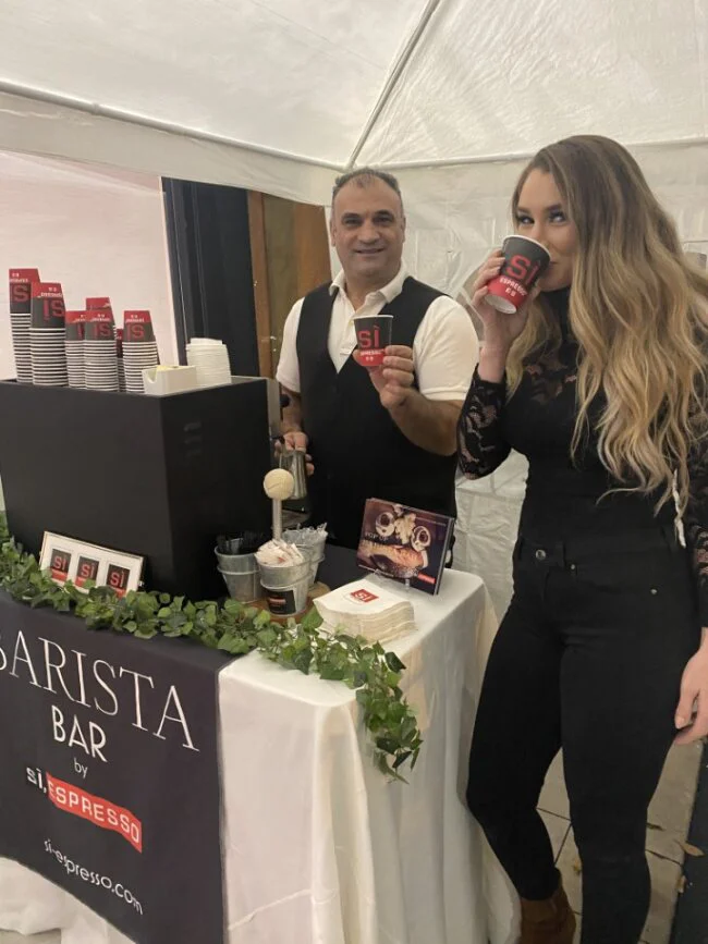
- Staff visibility: The vest embroidered with the Si Espresso logo clearly identifies who’s working this booth, and the vertical display doesn’t hide them either.
- Symmetrical display: The center part of the booth where the menu is placed is surrounded on either side by taller objects, lending balance to the display. Faux plants on both ends add to the sense of symmetry.
- Clear signage: Si, Espresso has clear, easy-to-read branded signage, and the neon sign in the second picture is intriguing and attention-grabbing. Their menu is displayed nicely in the center of the table and protected behind glass, reducing the chances of it getting damaged throughout the day.
- Thoughtful decorations: The faux greenery adds a nice pop of color to Si, Espresso’s display without distracting from the product or adding unnecessary clutter.
Mysticools Garden
TikTok: @themysticools333
What We Love
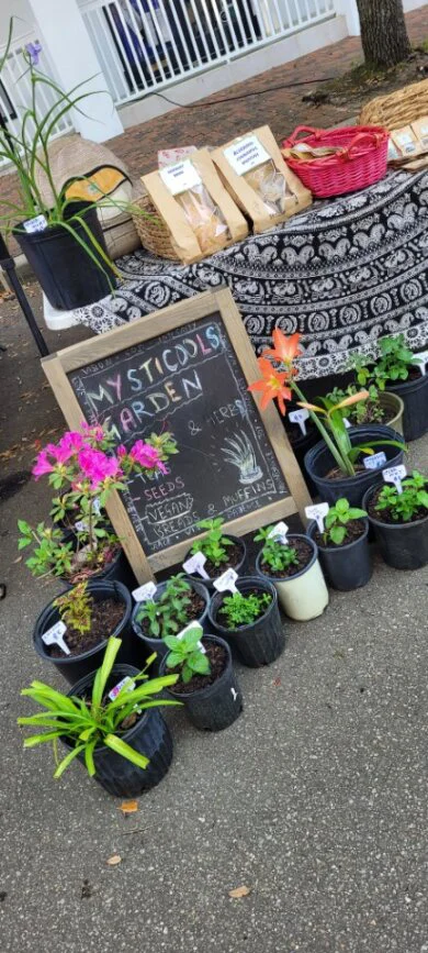
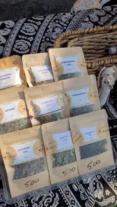
- Baskets and shelves: Mysticools Garden offers everything from tea to plants and they organize it all with baskets and shelves that add just as much visual appeal to their booth as functionality.
- Prices clearly displayed: It’s easy for customers to tell how much each item is because the price is clearly labeled on the bags of tea, baked goods, and plants.
- Easy-to-read signage: The chalkboard in front of the booth makes it easy to see what’s for sale at this booth while also looking fun and inviting with handwritten lettering.
- Colorful setup: Part of what makes Mysticools Garden’s display so intriguing is the pops of color and patterns they use. From bold baskets to a printed tablecloth to flowering plants, their booth is attention-grabbing without going overboard.
“Be present enough so that you’re able to make eye contact with customers when they cross your tent. Nothing discourages a customer from buying more than when an employee is facedown staring at his/her phone when they pass your tent. Put items which visually sell themselves from a distance (e.g. plants) in the front, and then the ones which don’t visually sell themselves from a distance and need further explanation (e.g. tea packs) further back in the tent.” –Mysticools Garden
Protect Your Farmers Market Booth With Insurance From FLIP!
You’ve got the goods, and you’ve got an eye-catching vendor table setup, but that’s not all you need before you hit the market!
Many farmers markets require you to carry liability insurance and will ask that you add them to your policy as an additional insured. This gives them protection from any accidents that happen due to vendor negligence.
But more importantly, farmers market insurance benefits your business because it shields you from having to pay completely out of pocket for expensive third-party bodily injury or property damage claims.
Learn more about seven real-life claims covered by farmers market insurance and start your journey to safe, secure vending today!

