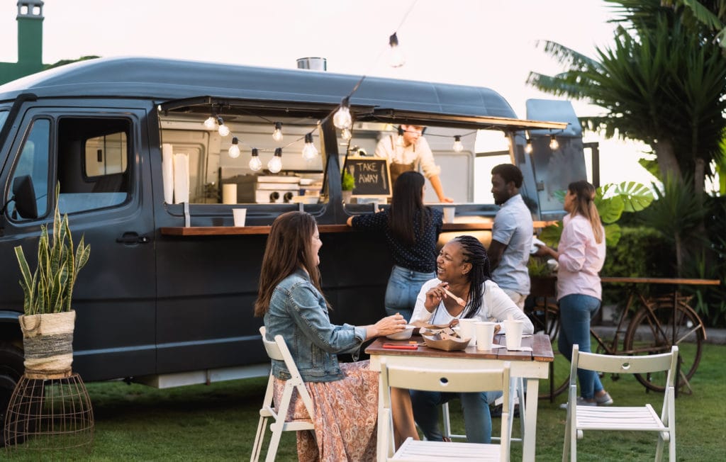
Food trailers already do a fantastic job at providing convenience to their customers, as well as being cost efficient for your field of work. However, what may deserve some extra attention is the first impression you make on the public. Because potential customers can only come from people who make the decision to exchange their money with your products, first impressions are a high priority. Visual impressions of your trailer will heavily influence this factor, and the best way you can accomplish this is by revamping your trailer’s appearance through customized vinyl wraps.
More effective than standard aluminum wraps, customized vinyl wraps provide your business with more benefits than the standard. For one, having your trailer’s name enlarged in a public area provides the opportunity for branding and free advertising. Even when someone just passes by, having your business name openly displayed can influence their purchasing decisions. In addition, vinyl wraps give your business credibility. People are much more likely to purchase products that have a well-designed visual element to support it. The business name, description, and contact information can make that crucial difference in people’s purchasing decisions.
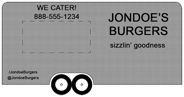
What then makes an effective vinyl wrap? We’ve comprised here a condensed guide that walks you through various design elements and practices that you should take into consideration when designing a wrap. We’ve also included visual examples that use each element to construct an example of an effective food trailer wrap.
CONTENT
FONTS
Fonts are a great way to add personality to your business name and information, and indeed they’re certainly more interesting than the boring standard word processor fonts. However, because of this, it is one of most abused design element. Amateur designers very often misuse the art of selecting and using fonts that they think makes their business look interesting, but in reality exposes their amateurity. Like any piece of artwork, each element must be carefully selected to harmonize with the other elements.
In selecting fonts, be sure to follow these guidelines:
- Select fonts that you feel will fit the style and personality of your business, and also still be readable from far distances. Though some fonts look fun when you load them up on a word processor, they might be difficult to read from afar. The best kind of fonts to read from distances would be sans-serif fonts, or fonts with no anchor points in the letters. For a visual example, compare Times New Roman (a serif font) with Verdana (a sans-serif font).
- Only use one or two fonts in the entire design, with an absolute maximum of three. Having more than this will be too visually messy for anyone to want to read. This is because it’s more work for our eyes to adjust to each font style, decipher each of its letters into words, and then gather one single meaning from the same object.
- Select fonts that aren’t too similar to one another. This will help with design contrast (explained later in this blog post) and with preventing the fonts from “fighting” one another. The more different they are, the better they’ll complement each other.
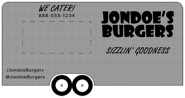
- Don’t be afraid to differentiate your font sizes. Keep the really important information (such as your business name) in a large size, and make less important information (such as social media names) into a smaller size. This also helps with contrast, as well as drawing people’s attention to the elements you want them to look at.
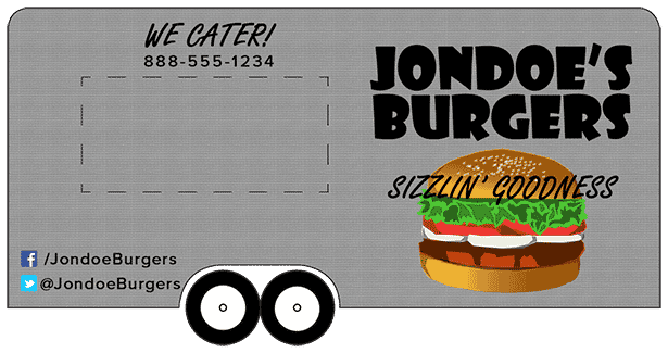
Using these guidelines, we’ve made the appropriate changes to our example:
GRAPHICS
Graphics are key visual elements to any good design. But like fonts, there is an art to selecting the right graphics. Amateur designers will also abuse this by selecting graphics they think makes their business look exciting, but in reality ends up looking like a mess of clipart.
To avoid this, here are some general guidelines on how to choose graphics for your wrap design:
- Keep the graphics relevant to your business. Whether it illustrates your business’s product, location, or your product’s origins, tie the information of your business to a relevant and appropriate visual.
- Use graphics with a simple design. Graphics with simple colors and shapes tend to distract less than more detailed graphics. Some wrap designs may be an exception to this, but if you’re starting out with a new design, it will be most beneficial to stick with simply designed graphics.
- Use graphics sparingly whenever possible. Similar to fonts, having too many graphics will make the design look messy and unpleasing for people to look at. To be safe with this guideline, try and choose one or two graphics for primary objects, and one graphic for a backdrop.
Adding these guidelines to our example wrap design gives us this:
BALANCE OF DESIGN PRINCIPLES
And finally, no matter how amazing your design may be so far, they must always be balanced with basic design principles that naturally draw people’s attention. This list of criteria is the bread and butter of vinyl wrap design because it best utilizes the art of visual rhetorics—of reeling in and leading the human eye in a way that’s aesthetically pleasing.
Here are four of the most common design principles:
- Contrast — Elements in the design stand out from each other. Whether it’s colors, shapes, textures or sizes, we humans tend to better notice differences. Therefore, it is important to include elements in your wrap design that are clearly distinguished from each other. This principle has been referenced in other design elements of this blog because it is one of the most significant principles you can apply to nearly any aspect of design. Definitely take advantage of it in designing your wraps.Colors are used the most often in creating contrast. To learn about how you can select the right colors for your business, check out our blog post about food color theory.
- Proximity — Elements that are similar to each other are close in proximity, and objects that are not similar to each other are properly spaced apart. We humans tend to tie together information that’s physically close to each other. In your wrap designs, keep similar information (such as business titles) close together and other information spaced apart.
- Alignment — Elements in the design are in alignment with one another. In other words, you can draw invisible lines on the outside of the objects and they will all line up. Applying this principle in design is key in leading the human eye around a piece of work, and it can certainly be applied in wrap designs. Line up your information on the same invisible lines to achieve balance and symmetry.
- Repetition — All elements are consistent and use similar characteristics to not stand out from one another. Though it is important to create differences for contrast, you’ll also want to make sure you’re using similar techniques with similar objects. For example, keep your contact information the same font style and color, but make any other information (such as the business name) something strikingly different.
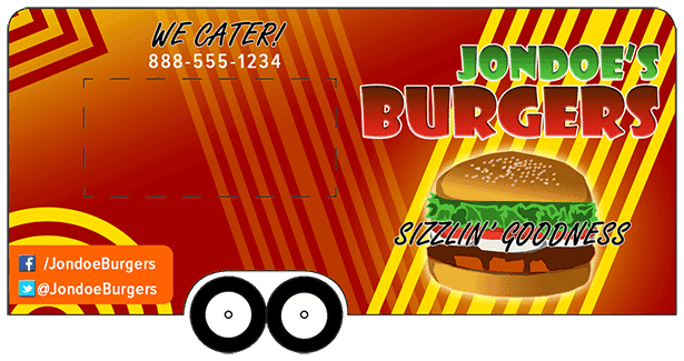
With these extra principles applied to our example, we end up with our final design:
Design is an important part of any business regardless of size or type—whether you sell food, market for a company, or even just advertise a yard sale at your home. It does wonders for businesses because it creates that important first impression on potential customers, and it can do wonders for your food trailer business as well. Take this guide’s tips into consideration as you create your vinyl wraps and form a better connection to your customers. And as always, FLIP has you covered if you need liability insurance for your food trailer business.
Do you think these tips are useful? Let us know your thoughts on our Facebook page!

BY ASHLEY BAKER
Ashley Baker writes about marketing, business, and insurance for small business owners and entrepreneurs.
Ashley is a former Licensed Massage Therapist. She has a background in writing for state political offices, newspapers and was the web editor for two regional magazine publications. When she’s not writing, she’s spending time with her family, attending college football games or kayaking. Find Ashley on LinkedIn, Instagram, or Twitter.

