Last week, we talked about how to create an effective and visually engaging design for a food trailer vinyl wrap. In this post, we’ve comprised a list of our top five favorite wrap designs that we believe have successfully used the rules of visual rhetoric to achieve a good first impression on their customers.
This is our condensed list of criteria we used to make our top five. To read about this criteria more in depth, check out our design blog post.
- Essential content — Business’s name, number/email, and social media are provided in proper sizes and locations.
- Compelling graphics — Graphics are relevant to the business, simple in design, and used sparingly.
- Complementary fonts — Fonts are readable from afar, consistent, and do not “fight” with one another.
- Balance of design principles — Basic design elements (contrast, repetition, alignment, proximity) are aesthetically balanced to naturally draw in people’s attention.
And now, here is our top five list of awesome food trailer wraps:
5. BIG RAGU ITALIAN KITCHEN
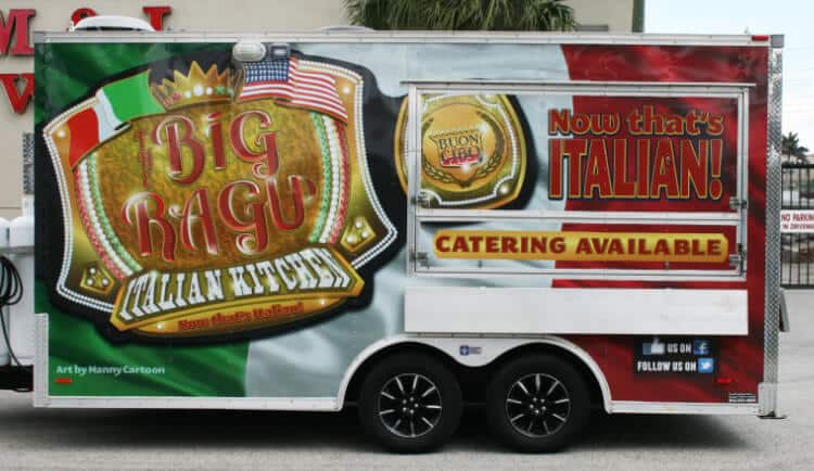
Photo: carwrapsolutions.com
First on our list is Big Ragu Italian Kitchen, a food trailer specializing in Italian food. This wrap design achieves the rule of simplicity and contrast by using one graphic for the background and another for the business name, as well as matching the colors to their product theme of Italian food. They’ve also provided some information about their business, like their catering service and their involvement with social media.
We would recommend only two improvements to this wrap: include a business contact detail on the design than just social media, and change the color of the phrase “Now that’s Italian!” to white or green to better contrast with the background.
4. PHILLY GRILL

Photo: carwrapsolutions.com
In fourth place is Philly Grill, a grilling trailer. This wrap, much like Big Ragu, stuck to a simplistic design by spreading two graphics, and then using its colors to gain contrast. We like how they’ve made their business name and phrase large, as well as their inclusion of company details (a website URL and social media).
For a small improvement, we would recommend including a picture of their food somewhere in the design. Seeing the words “grill” and “steak” would be more powerfully stated with a visual to support it.
3. WHITE'S ALL AMERICAN CONCESSIONS
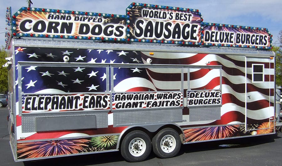
In third place is this eye-candy wrap design belonging to White’s All American Concessions. This food trailer has a wide range of products available to their customers, and they’ve done well to illustrate that in their design. The design has attained strong contrast by using graphics with strong colors, as well as large bold fonts. And as a bonus, they’ve installed lights around the top, which is sure to draw people’s attention from afar.
Though the overall design is stunning and very well done, it is lacking content that we explained in our design blog is crucial to all vinyl wrap designs. We were not able to find the business’ name on the design, though it is likely the name could be on the other side of the trailer or on the truck hauling it. Nevertheless, we would recommend adding the business name on the trailer, as well as other contact details like numbers and social media.
2. AMOUR DE CREPES
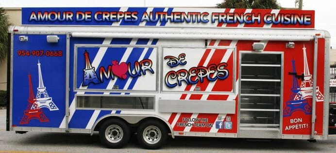
Photo: carwrapsolutions.com
Our second place wrap design is Amour de Crepes, a trailer specializing in French cuisine. We like this wrap design because it achieves simplicity without sacrificing detail. Like Big Ragu, it uses colors that match the theme of their product, and then use them in an aesthetically pleasing manner to attain good contrast. They’ve also done well to include all essential business information: name, number, social media, and extra phrases.
Though the colors look great with the design and the product theme, as a whole they all seem to blend too well with each other. We would suggest adding in an object that stands out from the colors, which will better help with contrast.
1. THE MOJO GRILL & CATERING CO.
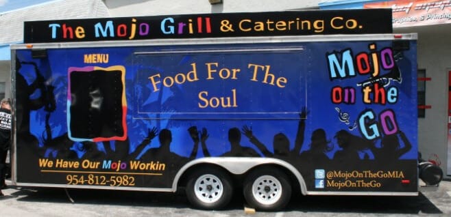
Photo: carwrapsolutions.com
Presenting our first place wrap design, The Mojo Grill & Catering Co.! We love this design because it aces all of our criteria: essential business content has been included, fonts are readable and matching, graphics are simplistic and not overused, and all other elements in between are properly balanced. We especially like the contrast this wrap accomplishes with their colored name against their dark-colored background. Though not quite as flashy as White’s Concessions, it is still just as strong of a design.
This design has earned first place because there is little we would suggest for improvements, other than some minor element adjustments to help with contrast.
Our culture has been, is, and will continue to be a visually oriented group of people. We depend on visual elements to guide us through the many different services available to all of us. For the vastly large food business, it is an important element that will do your business nothing but good.
Using the our design tips, as well as seeing good examples from this top five list, we hope you consider giving your food trailer business a vinyl wrap makeover to let people know how great your business is. If you need liability insurance for your food trailer business, FLIP has you covered!

BY ASHLEY BAKER
Ashley Baker writes about marketing, business, and insurance for small business owners and entrepreneurs.
Ashley is a former Licensed Massage Therapist. She has a background in writing for state political offices, newspapers and was the web editor for two regional magazine publications. When she’s not writing, she’s spending time with her family, attending college football games or kayaking. Find Ashley on LinkedIn, Instagram, or Twitter.


